


The Rise of Anti-Branding Aesthetics

The loudest brands today barely say a word.
A logo so subtle you barely notice it. Fonts that look like they came straight from Microsoft Word defaults. Packaging so simple it could be mistaken for a generic store brand. This is what dominance looks like now.
Anti-branding isn’t a rejection of branding—it’s branding at its most calculated. It’s a flex. It’s a statement. And in a world where everything is screaming for attention, the quietest brands somehow manage to be the most powerful.
But here’s the question: if every brand starts rejecting traditional design, what’s left?
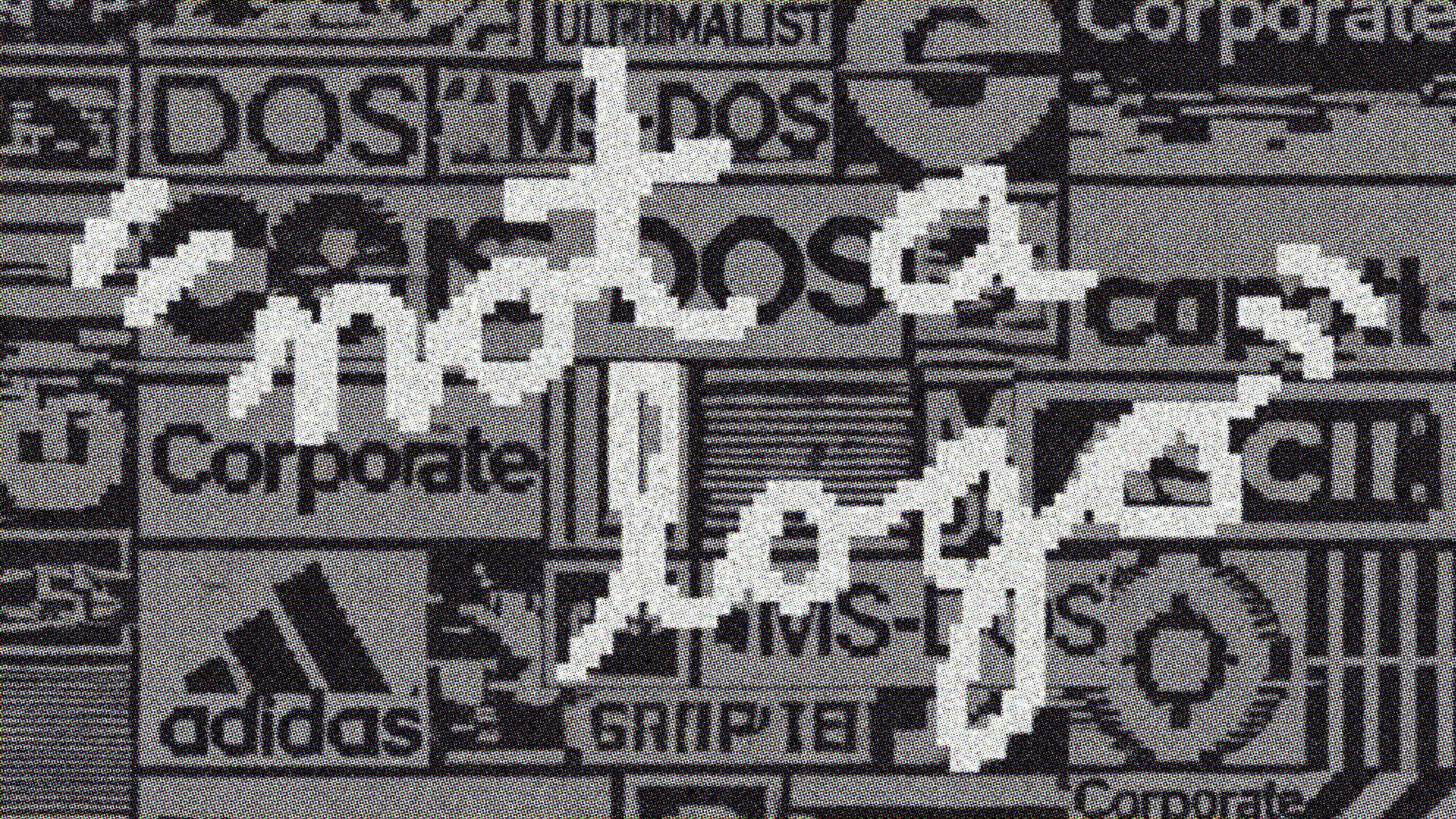
Branding used to be about making a mark—big, bold, unmistakable. Think of ‘80s and ‘90s branding: loud logos, bright colors, splashy graphics. It was all about showing up big. If your logo wasn’t instantly recognizable from across a parking lot, you weren’t doing it right.
Then things shifted. Luxury brands started dialing it down. Streetwear brands made a statement out of barely making a statement. And before long, anti-branding wasn’t just a niche aesthetic—it became the default.
Supreme nailed it first. The box logo, pulled straight from Barbara Kruger, was about as minimal as it got—a red rectangle with Futura Bold Italic. The irony was that it looked like nothing, but became everything. Maison Margiela did it differently, stripping their branding down to a blank white label held in place by four stitches. The idea was simple: if you knew, you knew. Muji pushed it even further, rejecting excess design altogether and letting functionality be the brand. Apple, when Steve Jobs returned in the late ‘90s, moved away from rainbow colors and into monochrome, understanding that the power of the mark wasn’t in its decoration but in the restraint behind it.
Bottega Veneta removed its logo entirely. Balenciaga leaned into blankness. The Row made its name on silence. The less you told people what your brand was, the stronger it became.
The shift wasn’t just aesthetic—it was psychological. When branding became too much, when the world became oversaturated with noise, the quietest brands started to feel like the most confident ones. The psychology of “if you know, you know” is as old as exclusivity itself. Luxury used to mean gold logos and embroidered monograms; now it means no branding at all, just a perfect cut, the weight of a fabric, the drape of a silhouette. If you need a logo to prove something, you’ve already lost.
Social media accelerated the shift. Once, Instagram was a place for neon filters and hyper-stylized grids. Now, the most powerful branding is muted, understated, almost invisible. Aesop bottles lined up in a bathroom tell you more about someone’s taste than a designer handbag ever could. Glossier’s pale pink packaging feels effortless, but every detail is designed to feel that way. The best anti-brands don’t feel like they’re trying—but they are, obsessively.
There’s a trust that comes with anti-branding. The simpler something looks, the more honest it feels. A basic sans-serif, a plain brown bag, a neutral palette—it creates the illusion that nothing is being hidden. Warby Parker, Everlane, and countless direct-to-consumer brands figured this out early, using stripped-down branding to create an aura of transparency. The less a brand looks like it’s selling you something, the more likely you are to buy it.
But anti-branding is a trick. A carefully crafted illusion of effortlessness. The same brands that look like they don’t care have spent millions designing that exact feeling. Balenciaga’s branding is aggressively plain, but that’s the point. Apple’s packaging is so minimal it feels inevitable. Nothing is accidental.
Not every brand pulls it off. When Gap tried to simplify their logo in 2010, it backfired instantly. It wasn’t sleek—it was forgettable. When American Airlines went minimal, it lost all the personality it had spent decades building. Even Instagram’s logo shift to a neon gradient felt like a betrayal to users who had grown attached to its old-school charm. Anti-branding only works when it feels intentional. When it feels like a desperate attempt to follow a trend, people reject it.
The question is: where does it go from here? Trends cycle. The Y2K aesthetic is creeping back in, bringing chaotic collage design with it. Brands like Diesel are embracing loudness again. Maximalism is bubbling under the surface, waiting for its moment. It’s only a matter of time before branding swings back in the other direction.
But anti-branding isn’t going away. Not completely. The brands that survive will be the ones that understand the balance between clean and character. Stripping everything away works—until it doesn’t. If you remove too much, there’s nothing left. Minimalism only succeeds when there’s still something to hold onto.
The best brands don’t need to be loud. They don’t need to put their logo on everything. They know that real power is in restraint. But minimalism isn’t the absence of branding—it’s branding with extreme control. It’s knowing exactly what to take away and what to leave.
Because when a brand gets it right—when it strips itself down to the core—it doesn’t disappear. It becomes unmistakable.
And if you’re figuring out what that means for your brand, my team and I can help.
